We are going to share with you eleven of the most inspiring Shopify stores we’ve come across. These stores are paving the way for a newer and better ecommerce future. They are great examples to look up to because they are successful in everything they do.
So what’s so special about these ecommerce stores? A lot actually. They all have aesthetically pleasing homepages, bold photography for product pages, neat navigation, innovative products, color themes, a call to action button with simple copywriting, and easy to use minimalist layouts.
Get Inspired By These Shopify Stores
As you check out these Shopify stores, make sure to click through to their websites and explore a little bit. Ask yourself, why is this homepage visually appealing? Why is this product so alluring? What types of links do they have on their footer? What color themes have they chosen and why?
As you answer these questions, you’ll soon discover that all of these companies have one thing in common: they’re awesome at what they do. They’re branding techniques really do work.
We hope these inspiring ecommerce shops will help you come up with fresh ideas for your own store!
Bsily Socks
Here’s a brand that truly shines. Bsily is all about creating fun, silly, mismatched socks that actually look really stylish. Driven by the phrase “Life is too short to wear matching socks,” power couple Sam and Lily have made their lives passion to follow their dream of creating a light-hearted, creative textile brand for everyday people. Make sure to follow them on Instagram where they feature the very best of their mis-matched socks.
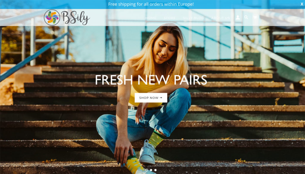
Image Credit: Bsily
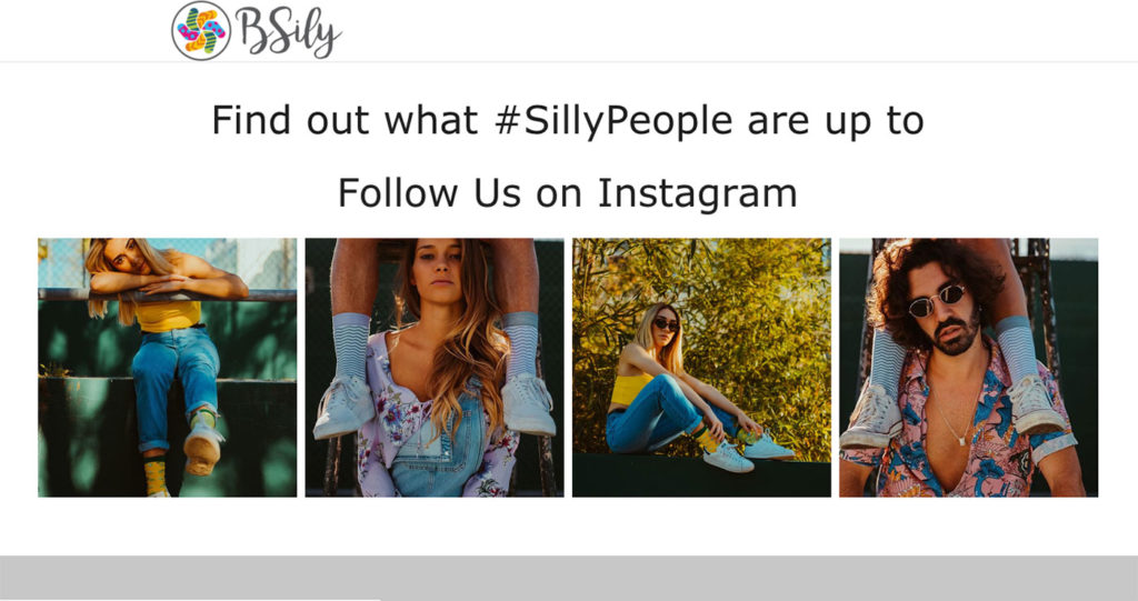
Image Credit: Bsily
Nick Mayer
This store is special because it sells original watercolor paintings and prints that are mostly oceanic in nature. Nick Mayer is a renowned artist who specializes in depicting realistic paintings of fish, birds, and plants. His simple, yet elegant homepage feels as if you’ve stepped into a gallery. A carousel of paintings is decorated with customer testimonials which adds an element of social proof. The call to action button “Shop Now” is perfectly positioned in the middle of his homepage. This is the perfect way to get visitors browsing your products! If you’re an artist who wants to sell your art online, make sure to check out Nick’s store for some inspiration.
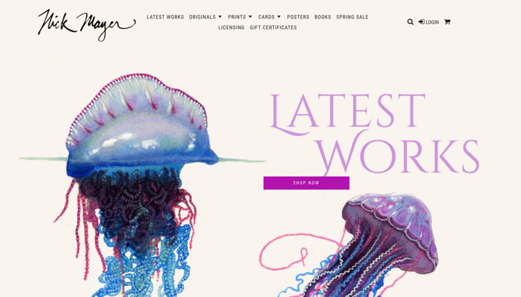
Image Credit: Nick Mayer
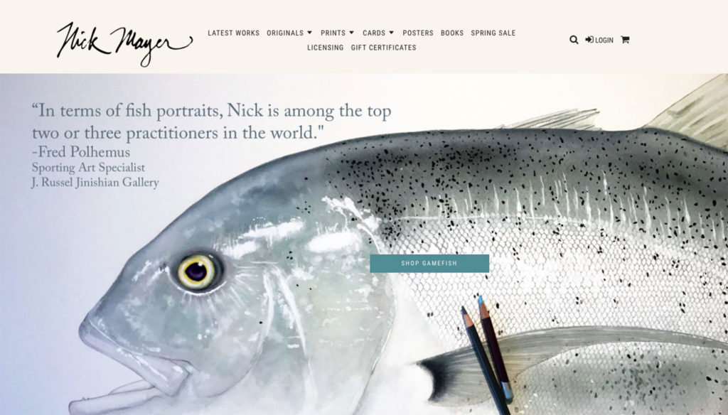
Image Credit: Nick Mayer
Pipcorn
Pip snacks is a food company started by a brother sister team who decided it was time to share their amazing popcorn with the world. Pipcorn is different than other brands because it’s non-GMO, made in the USA, and made in small batches. We love their website because it features a sleek navigation panel that includes helpful pages such as FAQ, Store Locator, and a unique About Us story. They also have several featured videos of real people sharing their “mini moment” which adds a touch of humanism.
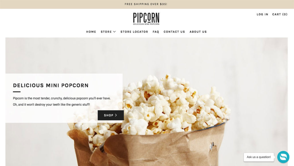
Image Credit: Pip Snacks
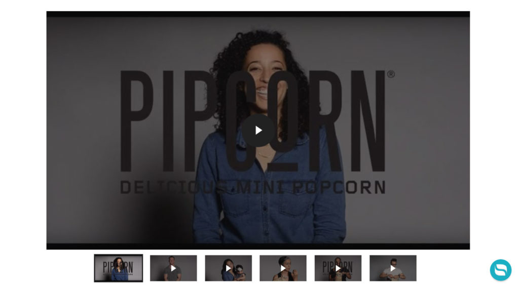
Image Credit: Pip Snacks
Litter San Francisco
Now here is a brand that knows how to keep it simple. As soon as you land on Litter’s homepage, you’ll be confronted with stunning photography featuring their jewelry line. We particularly like that they offer a “Lookbook” in their top navigation panel which takes you to a page containing themed portfolios such as To Have and To Hold (jewelry for a wedding) and The Traveler (bohemian style jewelry). Lastly, we love how they use “Bag it” for their “Buy now” button and offer related items.

Image Credit: Litter SF
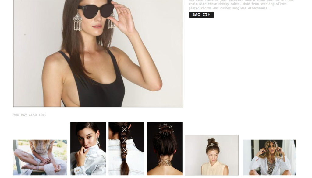
Image Credit: Litter SF
Telegramme Paper Co.
If you’re looking for personalized prints and customizable framed artwork, you should definitely check out Telegramme Paper Co. This paper company is changing the way we shop. Out of all the other Shopify stores that offer paper products, we found Telegramme to be the most alluring because their website does such an excellent job at selling their products. We particularly like how they display all of their product categories on their homepage with beautiful photography and playful typography. By clearly communicating what kind of products they have available (cards, screen-prints, personalized items, and stationary) they are more likely to retain customers who are looking for these types of services.
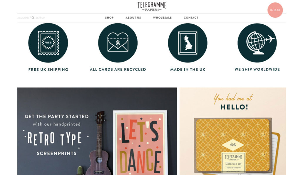
Image Credit: Telegrammer Paper Co.
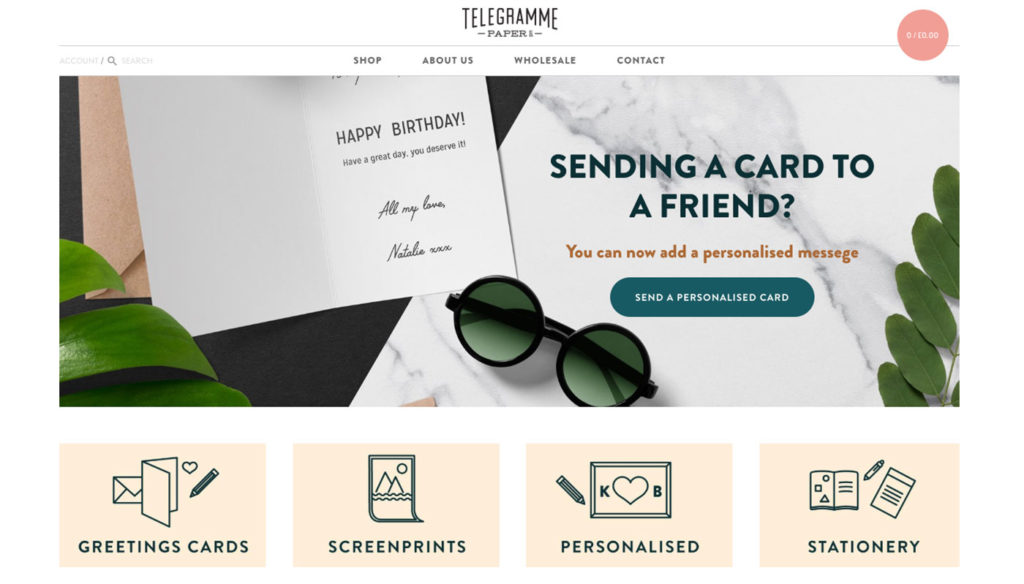
Image Credit: Telegrammer Paper Co.
Madsen Cycles
A new bicycle company has arrived, and it’s called Madsen. We love the whole design of their store because it features bright colors with a large call to action button that reads “Pick a Bike.” As you scroll down, you’ll notice a video showing their cargo kid bike in action (proving it’s the perfect addition to any house). They also feature an Instagram feed showing their bicycles being used all around the USA (which is great for increasing customer confidence). If you’ve been searching around for Shopify stores that inspire, this website to definitely worth checking out!
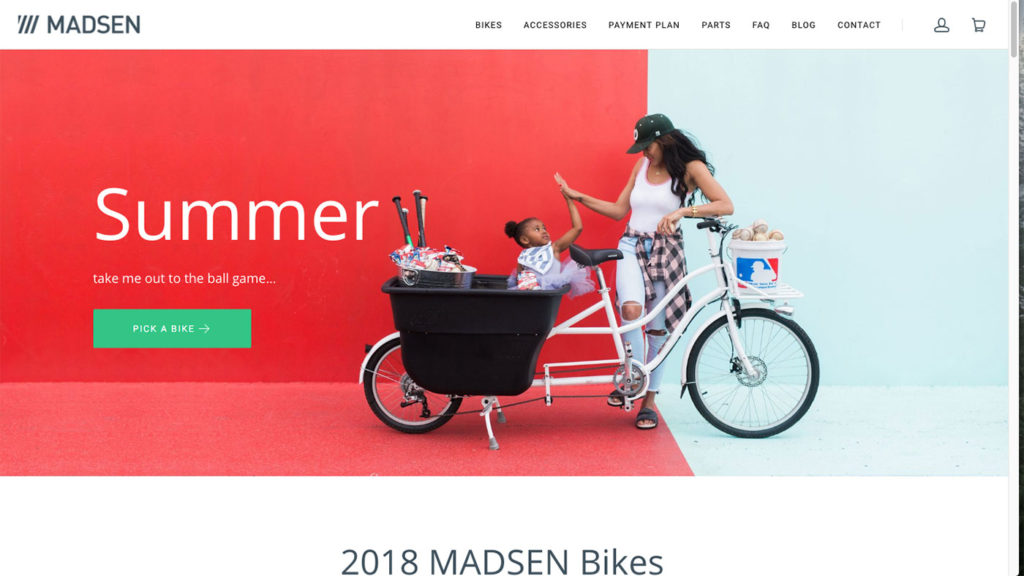
Image Credit: Madsen
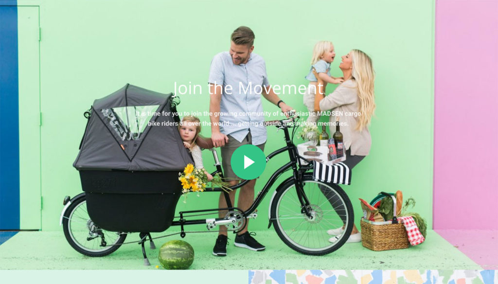
Image Credit: Madsen Bikes
Pop Chart Lab
Pop Chart Lab sells (you guessed it!) charts. Their specialty posters range from South Park characters being charted to a complete charting of the Beatles’ song catalog from 1963-1970. We love that their website offers gift guides such as Beer & Liquor Enthusiasts, Nature Lovers, and Bookworms.” By offering a group of related products that you think your customers might like, you can increase sales your sales and improve your customer conversion rate. Another neat thing about this site is that they show you how each poster will look like in your house by showing it framed and on a wall. For more tips on how to improve your product images, check out our Top 7 Product Image Tips Guide.
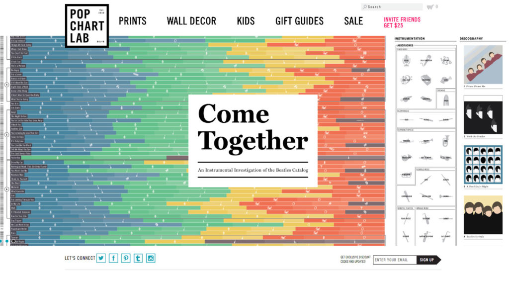
Image Credit: Pop Chart Lab
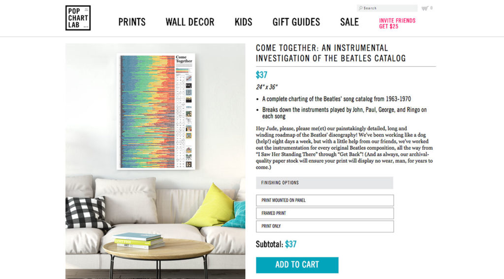
Image Credit: Pop Chart Lab
Biolite
Finally, an outdoor company that really cares. Biolite specializes in making camp stoves, lights and solar panels so you can live life off-the-grid. Out of all the Shopify stores that sell outdoor equipment and gear, what makes Biolite so special? First of all, their mission statement is clearly defined on their homepage. They state that with every purchase, they will continue to deliver affordable energy to disadvantages continents such as India and Africa. Extremely heartwarming, if you ask us.
If you’re company is making an environmental impact on the lives of others, make sure to feature this as your unique quality that makes you stand out from the competition. Customers are more likely to purchase products that benefit a cause because it allows them to take part in the movement. Take for example Toms Shoes which donates a pair of shoes for every pair sold. They became famous because their cause was worth talking about. Featuring your mission statement on your homepage can have a positive impact on your company’s overall growth.
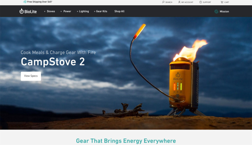
Image Credit: Biolite
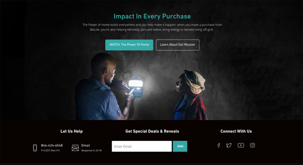
Image Credit: Biolite
Chalkd Ltd.
Chalkd is a unique comply that creates handmade blackboards that can be used in business and households. We really love their website because it shows how a blackboard is created (the old-school way). Showing the process of making your product helps the customer to understand how special your handmade goods really are. It communicates that this is a one-of-a-kind product, made just for them. Chalkd explains in great detail that each blackboard is created by hand, by real people. By showing how they frame each custom blackboard, the company is creating a brand that focuses on a hands-on approach.
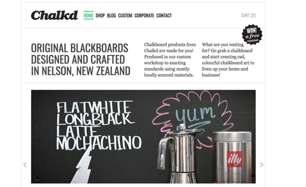
Image Credit: Chalkd
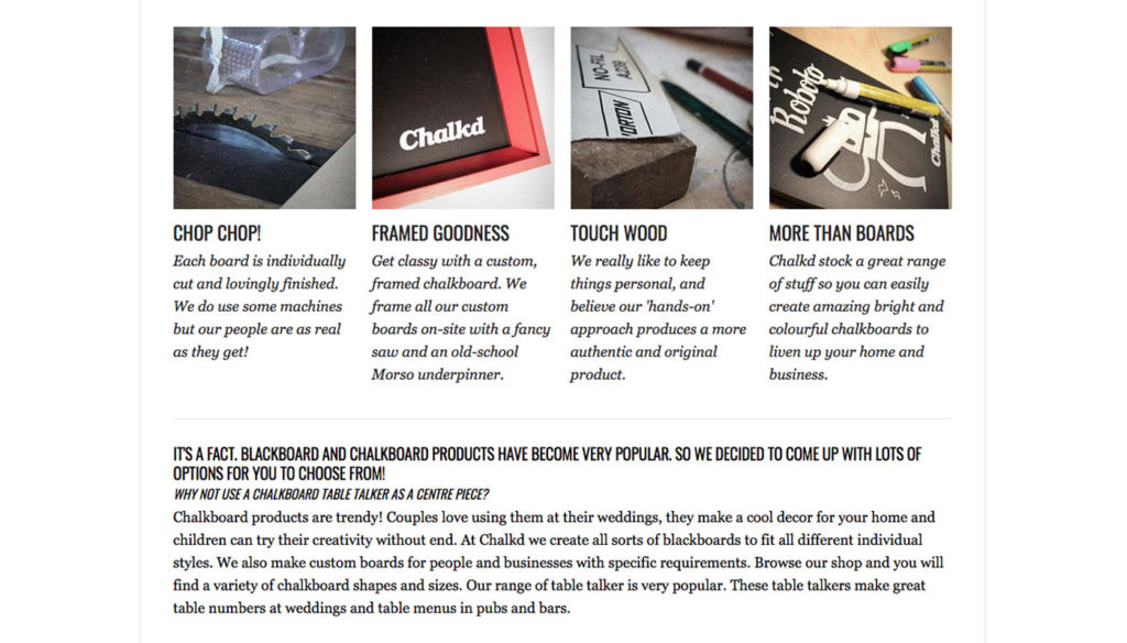
Image Credit: Chalkd
Skinny Teatox
Skinny Teatox is a tea company that focuses on creating tea blends for weight-loss. All of their tea is 100% natural and doesn’t require a diet (which is pretty cool). We love how they feature a call to action button that reads “See Reviews” on their homepage. This communicates to new customers that their products have actual testimonials that back up their claims. They also feature a simple infographic that show the benefits of their product. Having an infographic that explains why your product is so great is an ideal way to increase consumer confidence. One of the best features of the Skinny Teatox website is that they have a blog where they write regular articles about weightless and tea. By creating unique content, they are also attracting new visitors to their website through organic search results and SEO.
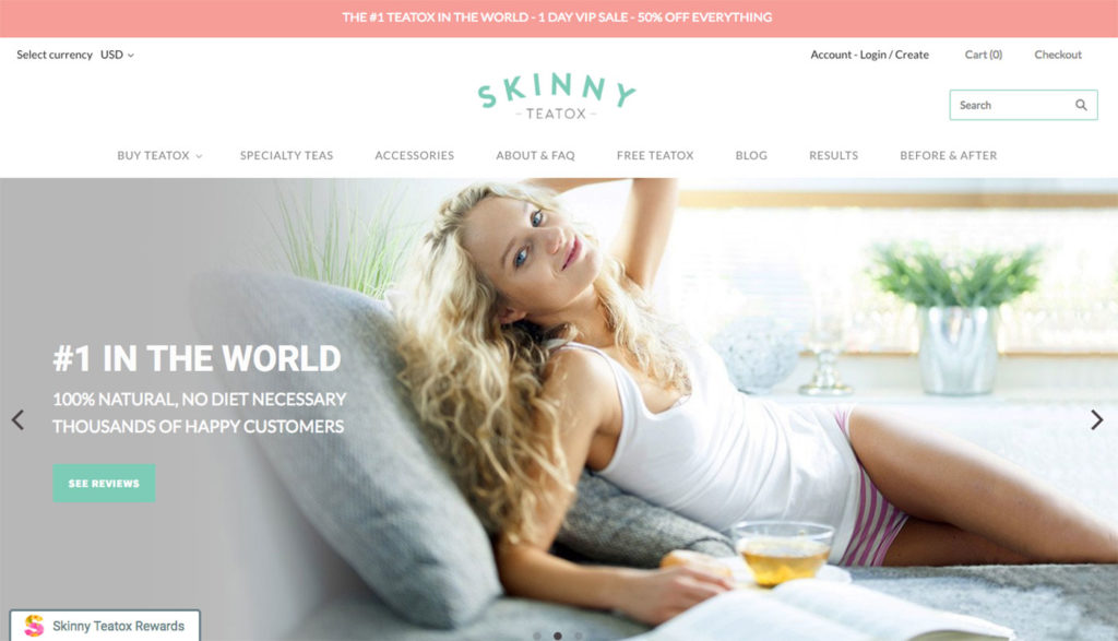
Image Credit: Skinny Teatox
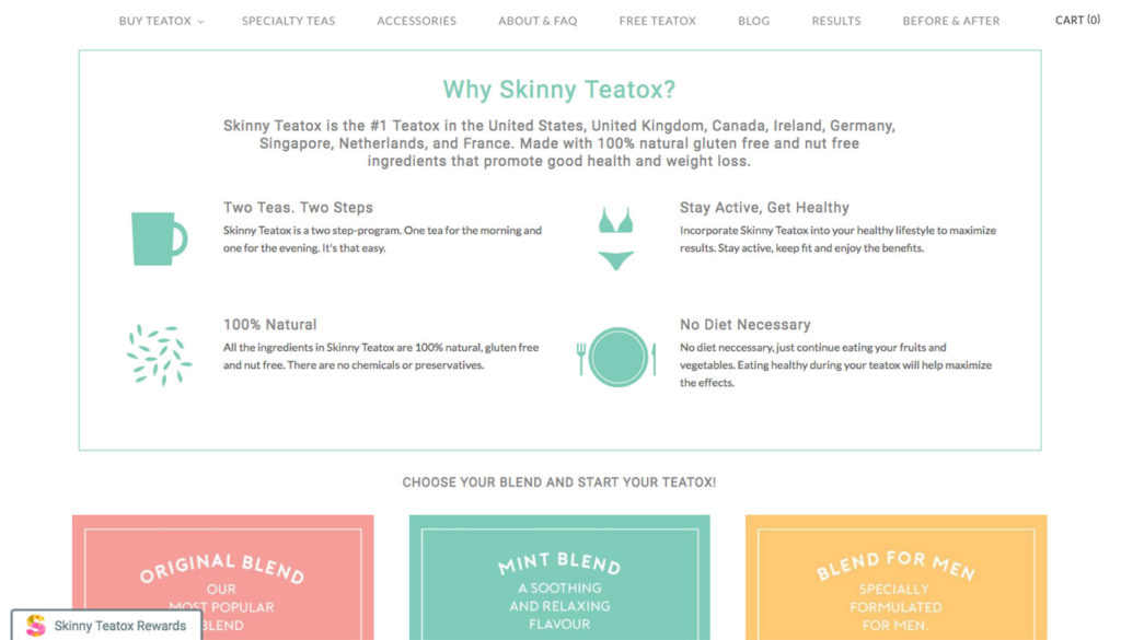
Image Credit: Skinny Teatox
Press London
Press London sells healthy juices and snacks. By using only white and green shades, their website radiates a message of simplicity and pureness. We love how they feature their juices with color themes (think green juice paired with green snacks). Another great trait of this company is their fun logo. The letter E in PRESS has wittingly been made to look like a drop of juice. On the bottom portion of their website, they also showcase where their products are being distributed which lends credibility and can fuel online purchases. Clean living & clean design = perfect branding!
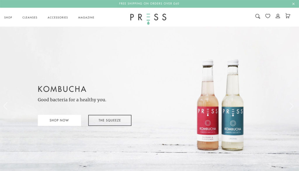
Image Credit: Press London
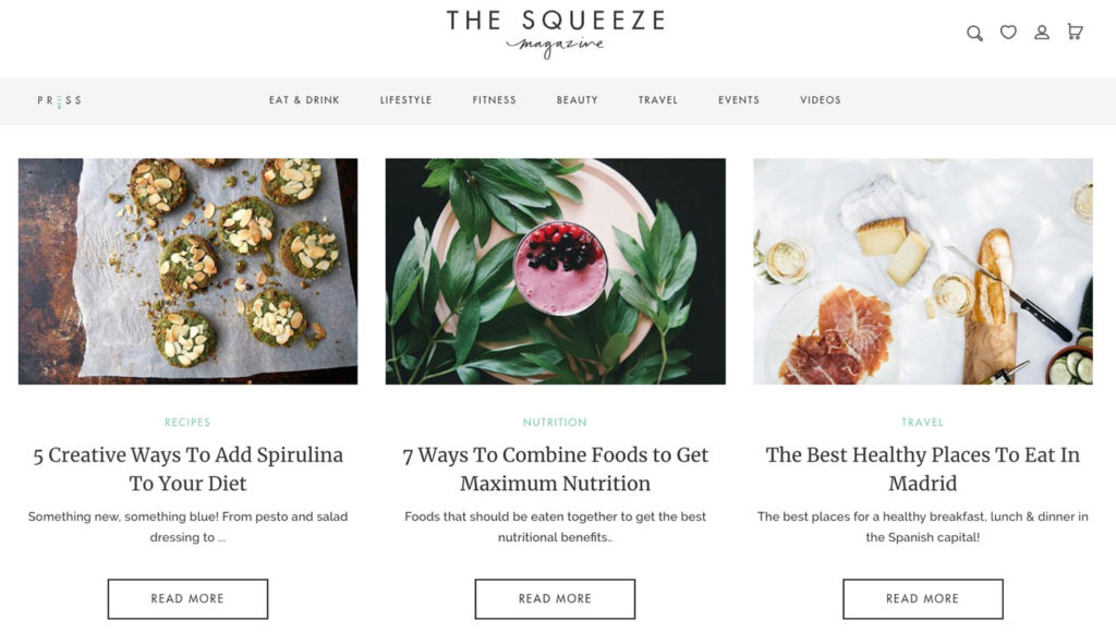
Image Credit: Press London
Improving your Store’s Design
How can you improve your Shopify store? Building the perfect storefront takes time and patience. If you ask any of these companies, they’ll tell you it’s mostly trial and error. Basically, try something new out and see how it performs! You can try experimenting with your copywriting for call to action buttons and see how your customers respond.

Adding a social element such as an Instagram feed is also a great way to add a splash of color and get people connecting to your brand. These Shopify stores all had one thing in common. They pushed their social media on their homepage which helps them gain a following of loyal fans.
Another great element to add to any Shopify storefront is an HTML sitemap which lists every product and page on your site. Having an HTML sitemap on your Shopify store helps customers easily find what they are looking for (without spending a lot of time searching for it). It also helps to increase your overall SEO and helps you to start showing up in search results.
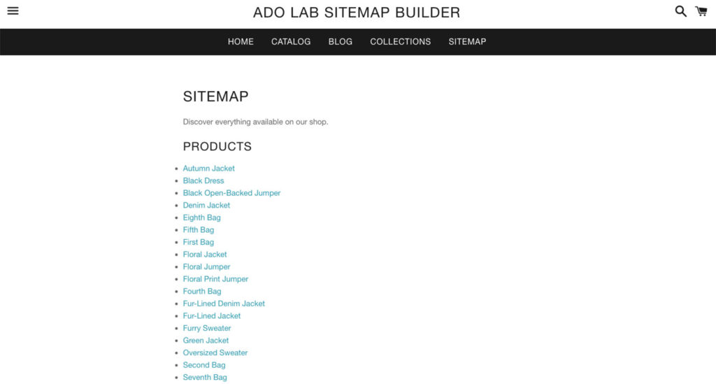
Sitemap Builder app, now available on the Shopify App Store
Sitemap Builder creates a personalized HTML sitemap for your store in just a couple of minutes! It even matches your theme’s color, style, and font right out of the box. Sitemap Builder has helped over a hundred Shopify stores (and counting) improve their customer’s shopping experience!
Summary
I hope you’ve enjoyed our line-up of the very best Shopify stores that inspire and motivate! Hopefully you’ll have some fresh ideas for how to spruce up your own store. There are so many different ways to approach a homepage, and no single style is the answer.
Whatever you do, remember that your brand is uniquely you and a reflection of the company’s values. Stay true to your overall message, and be clear in what you are selling. No need to overcomplicate your homepage with clutter or fancy copywriting. Keeping it simple is always the right way to go!
Shopify Success Newsletter
Don't miss out on the best tips and guides for Shopify sellers!


