When a customer is on your product page, they make that decision whether to buy or not.
A product page is very important for convincing a shopper to purchase an item. If you end up making the sale, you know your product page is working.
But what if your sales are lagging? There could be something you could improve on your product page.
If you’re interested in ranking higher on search engines, optimizing your product pages is the way to go!
In this article, we’ll explain a couple different ways you can improve your product page for both humans and search engines alike.
We’ll also include helpful tips and advice so that you can implement these changes over time.
Creating an Ideal Product Page
What does an ideal product page look like? An ideal product page is one that converts shoppers into paying customers. But let’s back up for a second.
Before a customer can even be on your store browsing items to buy, they need to first arrive at your store in search results.
By creating information rich descriptions on each and every product, you can rank higher and show up in search results.

Once you start showing up, the information you provide on your products should be specific enough that the shopper feels confident purchasing a product from your store.
Okay so now that we’ve covered what an ideal product page gets the customer to do, let’s go over how you can persuade someone to complete their checkout.
#1 Use Better Images
Good images sell more. Try making it a habit to only using high-quality, large images that clearly display every aspect of the product.
Having a good looking image can make the difference between a sale or an abandoned cart.
In fact, in a recent study it was proven that there is a 9% increase in sales with ecommerce stores that use better images.
Another great idea is to show lots of different angles of the product. One product image isn’t going to cut it these days.
Try uploading lots many images for the same product so that the customer can get a real feel for what they are purchasing. After-all, the customer is viewing these photos in order to see if they want to buy the product or not.
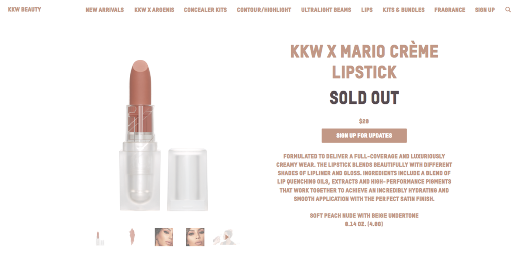
Some ideas are to show how the product looks on someone (such as clothing) in a natural environment (laying on a flat surface), or even next to another object for a size comparison.
KKW Beauty does an amazing job at showcasing their beauty products with high quality images. Check out their KKW X MARIO Crème Lipstick product images if you need some inspiration.
We particularly like how they display each and every color of lipstick on a palette and a model (so you can see what it truly looks like on skin).
Lastly, let’s not forget that these images can appear in Google image search results.
It’s important to remember that you’ll need to include ALT text in order for search engines to pick up your images. Having your products up in Google image search results is a great way to generate traffic and boost sales.
Check out our Top 7 Product Image Tips for some quick insight on how you can improve your product photography.
#2 Titles Do Matter!
In order for search engines to pick up your product page and display it on search results, it needs to contain relevant keywords. Relevant keywords are words that directly apply to your product.
They are the terms that people are most likely searching for in Google. If your product matches one of these terms, it has a good chance of showing up in search results.
For example, let’s suppose your Shopify store sells handmade leather purses.
You would want to make sure that your product title contains the word ‘leather purse’ because that is what people will be searching for.
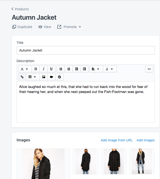
Although it’s very tempting to create snazzy titles for your products, but this isn’t the best route to. A coat titled “Autumn Jacket” doesn’t tell us much about the product. Is it for women or men? What color is it? What material is made with?

However, a very descriptive title such as “Women’s Autumn Black Cotton Zipper Hooded Jacket” tells us a lot more about the product.
If you do want to stick with snazzy titles for your products, all you have to do is click on “Edit Website SEO” on the product page and update the Page title tags to include descriptive words.
Lastly, remember to include these keywords in the url string of your product page.
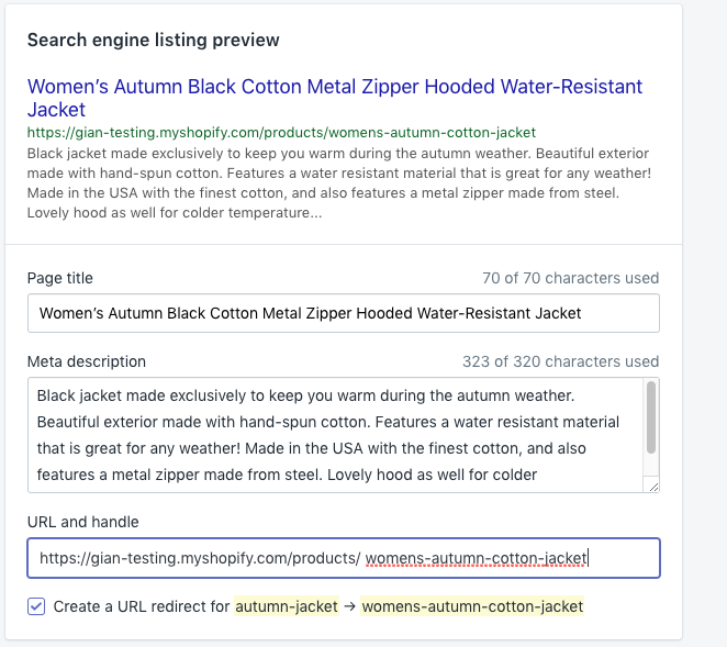
Create page titles that are rich in details about the product. It’s okay if they seem a little long. To maximize your total real-estate, use shortened information and abbreviations in order to pack the most into a small space.
Also, try including keywords about the product in the meta description. Some features you can touch on include: the collection it belongs to, available fit, wash, fabric content and size range.
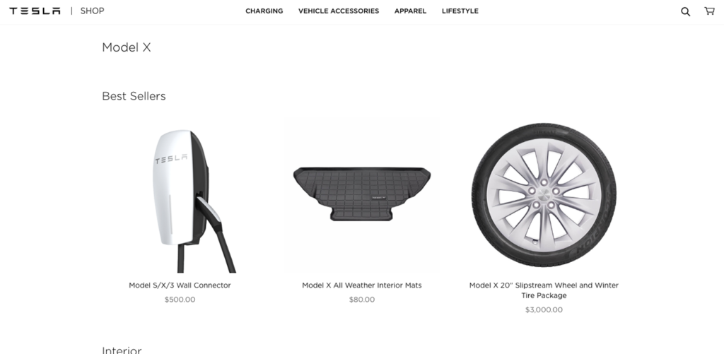
People looking at your products want to know every detail about the product they are looking at so make sure to tell them about it. Check out Tesla’s futuristic vehicle store for some inspiration on how to name your products.
#3 Testimonials Work
Telling people how much someone liked your product is a great way to convince them that they will enjoy the product as well.
Having quotes and reviews from previous customers shows that the product is tried and true. It also shows that other people trust your brand and are willing to shop at your store.
Reviews on your product page let people know if a product is highly rated. If your previous customers recommended the product, a potential shopper is more likely to click Add to Cart.
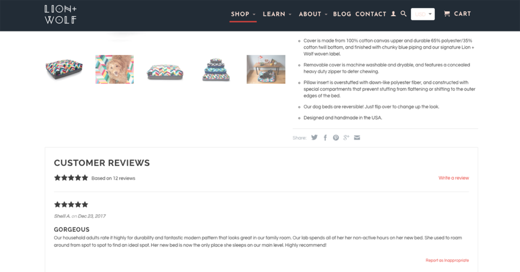
It’s never to late to start collecting these reviews. Reviews tell shoppers how it feels to own the product, from a first hand experience.
What if you don’t have any testimonials yet? You can always start reaching out to your existing customers and asking them if they could leave you a review after they’ve purchased an item.
For some inspiration on how to add social proof for your products, check out this cool dog bed company called Lion & Wolf. They boldly display their positive reviews beneath each product which really helps to create confidence in shoppers and drive sales.
#4 Keep It Minimal
Make sure your descriptions are straight to the point. What can I expect to receive if I buy this product? That is what people want to know.
Try not to make people search for what they are trying to find. Keep all important information such as sizes, material, and availability as boldly visible as possible.
Remember to not ramble in descriptions because this can lead to a higher bounce rate. One big mistake that ecommerce store often make is to oversell.
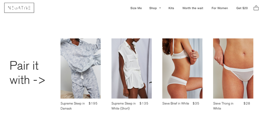
They offer countless products and discounts that crowd the space and make it hard to concentrate on the main product.
Try limiting your related products suggestions to a max of four additional products. By offering a small number of related products, you can potentially increase your sales.
It’s important to keep it simple and minimal so that the shopper can casually browse product by product, without feeling overwhelmed.
Negative Underwear does an excellent job at upsetting their products. On every product page, they offer four additional items that you might enjoy. They call it ‘Pair it With’ and then list the items that are similar in style and shape.
#5 Add a Product Video
There is nothing better than a video to explain what a product is truly like in real life! Most importantly, a video can show the product in action while a picture is just a still image.
If you have a product that does something such as a shaver or stroller, it’s a good idea to showcase how well the product performs. Adding a video is also great for marketing because it can live publicly on Youtube where people can find out about your products.
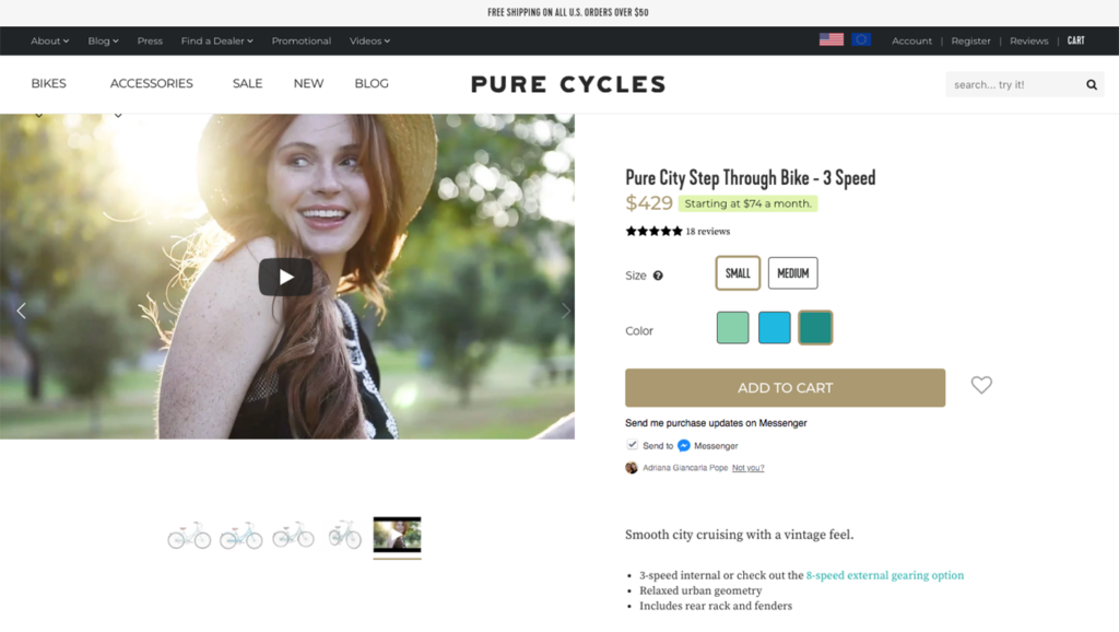
By embedding a video on your product page, you are also giving the search engines more to work with. Google loves when it sees videos on a website because it knows that there is a lot more information being provided.
Videos also help to lower the bounce rate on your store. People tend to spend more time viewing videos on product pages than reading descriptions.
We really enjoy the way Pure Cycles showcases their bicycles on their store. Their Pure City Step Through Bike – 3 Speed product page includes a high-quality informational video that tells you everything you need to know about this bike.
By including a video that shows us the bicycle in action, we are more likely to purchase the item if we are happy with the way it looks.
Summary
I hope you’ve enjoyed this article on product page optimization. By following this helpful tips and making some changes to your store, you can improve your chances of showing up in search results.
Search engines love product pages that are rich in information. When Google crawls, your product pages, you should give them as much information to work with as possible.
Give Google relevant keywords so that you can start ranking for those terms. Give Google robust product titles that tell them what your product is and does.

But let’s not forget about your customers.
Give your shoppers high quality images to look at when browsing your product pages.
Give your customers an informational video to watch that gives them more information than your written description.
Give your customers a handful of related products to choose from, but don’t overdo it!
Thanks so much for reading our guide to product page optimization.
If you have any helpful advice you’d like to share about how you optimize your product pages on Shopify, please share them in the comments below.
Shopify Success Newsletter
Don't miss out on the best tips and guides for Shopify sellers!

