How Can We Help?
How Do I Improve My Mobile Friendliness?
Is your website 100% mobile friendly? Every page on your website should be easy to use on a mobile device.
Here’s an interesting fact!
More than 77% of mobile users are actually using their smartphones at work or home.
People are addicted to using their phones for everything, including searching and shopping! With today’s high tech culture, you need to make sure that your website works perfectly on all smartphones and tablets.
Fixing your mobility issues are important because this can negatively affect your sales. If people can’t read what’s on your website, then they are going to leave without purchasing anything.
Secondly, mobility issues can hurt your rank on Google. Google tends to hide websites from search results that aren’t mobile friendly. This is not good, so make sure to make your website is as mobile-friendly as possible!
In this article, we’ll go over all the different ways you can improve the mobile usability of your site.
How can you tell if you’re website is mobile-friendly?
One of the features on Get Clicked! SEO allows you to conduct a Mobile-Friendly Test on Google. All you have to do is type in the URL you want to test and click on “Run Test.”
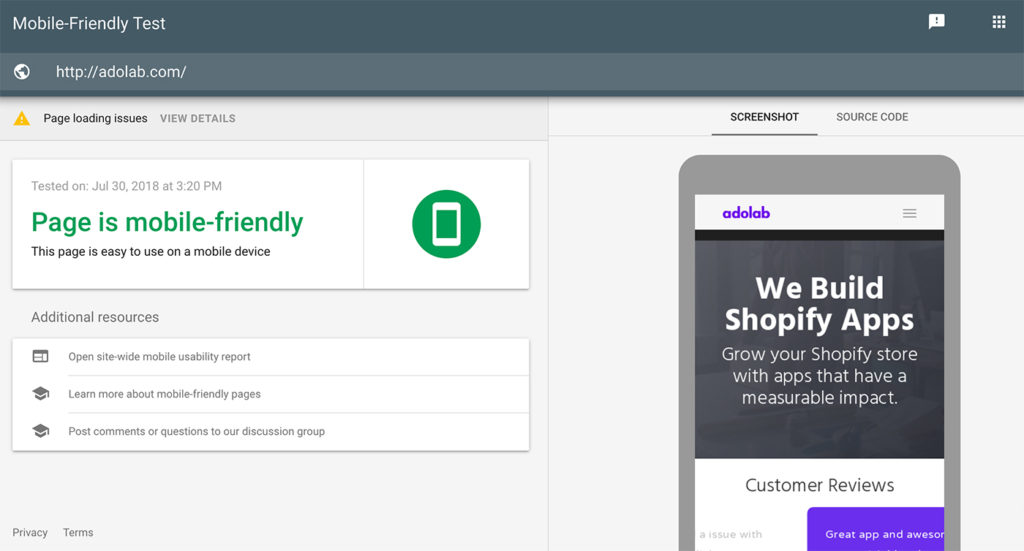
Google will analyze your page and determine if it is mobile-friendly or not.
The Google Mobile-friendly test will let you know exactly which usability problems visitors might be experiencing when they visit your website.
Top 4 Ways To Improve Your Mobile-Friendliness
Alright, let’s dive right in!
If you ran your website through the Mobile Friendly Test on Google and experienced some issues, that’s okay. We’re going to teach you why these issues might be occurring, and how you can fix them.
First of all, pay attention to any issues being reported on your Mobile Test page. These will be displayed in bright red.
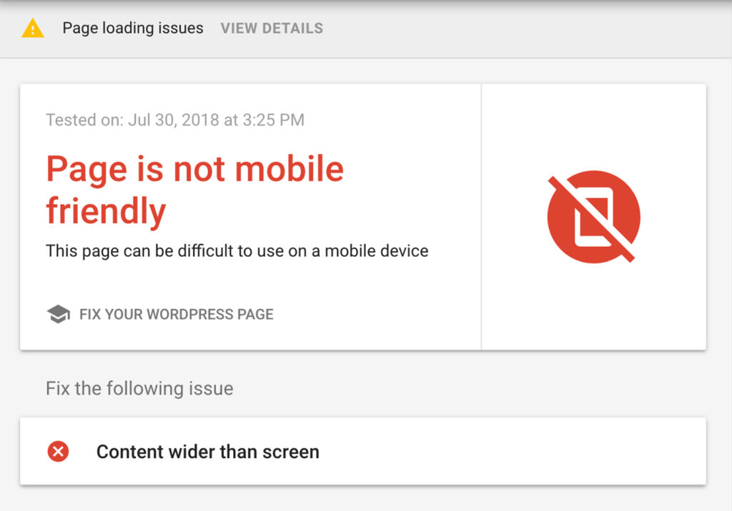
Errors displayed in bright red are considered a high-priority fix
To see which parts of your page aren’t fully loading, click on “Page loading issues.”
This is helpful for pinpointing exactly where the issues lie in terms of images or scripts that aren’t loading. More often than not, there might be an issue with your theme.
1.) Eliminate Flash from your website
Flash is usually used for displaying fancy animations and navigation. Unfortunately, Flash is not supported by smartphones or tablets. It’s a good idea to not have flash on your online store.
2.) Make sure your font size isn’t too small!
Mobile devices are much smaller than desktop computers. You want to make sure that people are able to read the words on your website. If people are forced to pinch and zoom in on your text, this is very bad.
Furthermore, if people can’t read your product description, this is a huge problem and can lead to people abandoning your website.
3) Make sure buttons & navigation links aren’t squished together
Buttons and navigation links are known as “touch elements.”
Since users need to be able to tap on certain buttons in order to navigate around your site, you’ll want to make sure that the buttons aren’t touching one another.
The last thing you want is for someone to tap one button and accidentally be taken to another page.
If all of your buttons are too close to each other, this can make is difficult for visitors to make sense of what they are clicking on. Fix the spacing on your touch elements.
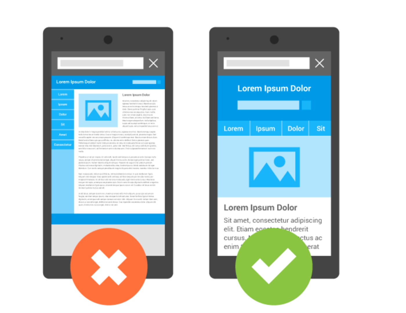
4.) Make sure your website is using responsive design!
Your website should look the same on all devices. Since mobile devices are much smaller than desktop computers, you’ll want to make sure that your website uses responsive web design.
Responsive web design will indicate a “viewport.” This is important so that your website automatically adjusts and scales according to the device being used.
View a Detailed Report
For those of you who enjoy charts and stats, you can always use the Mobile Usability Report which is available through Google Search Console.
On your Google Search Console Dashboard, click on “Search Traffic”. Then click on “Mobile Usability.”
This will tell you how many pages on your website have issues. It will also list the usability issues along with the exact URL for each page that you need to fix. Google Search Console is great for being able to see all of your issues listed in one convenient area.
Mobile-Friendly Test Example
In this example, we are testing out the popular site Amazon. You can see that Amazon.com is indeed mobile-friendly so they’ve passed the test with flying colors!
There website is easily viewable on all mobile devices which makes for a seamless shopping experience.
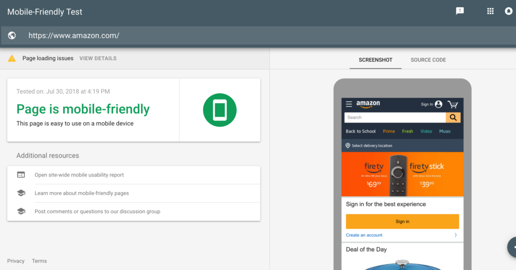
Although, even Amazon isn’t perfect. Google is reporting that some of the elements on their homepage aren’t loading fully. If we click on “Page Loading Issues” we can see all of the issues listed that need to be fixed.
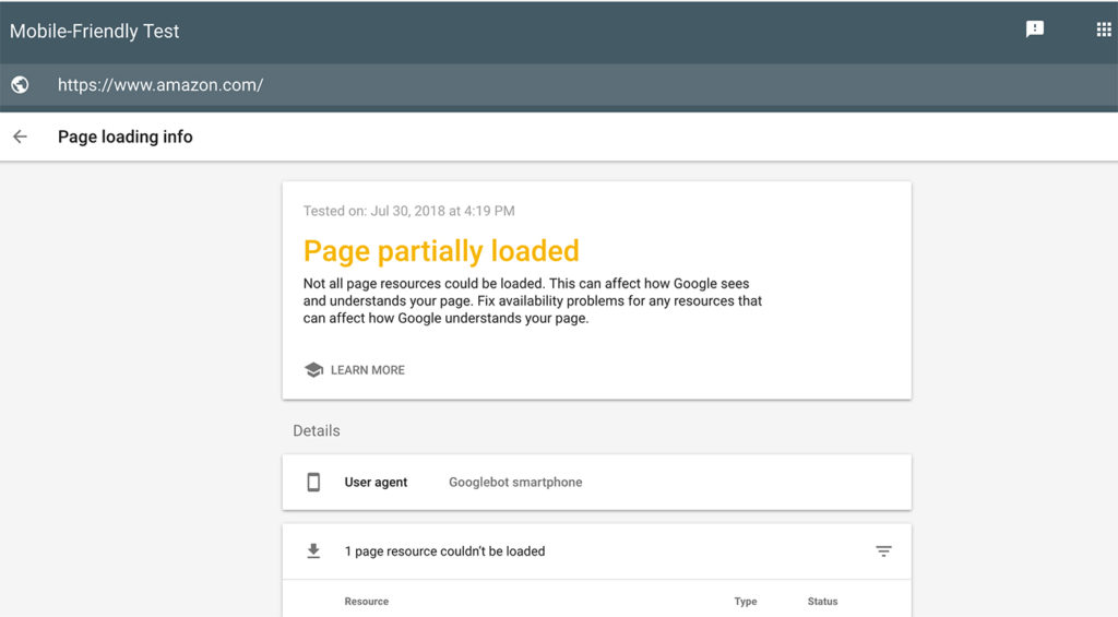
In this example we tested Amazon.com. These are their loading issues
Summary
If you have a question about how to make your website mobile-friendly, make sure to contribute a question to the Google Webmasters Forum. This is a great community where you can post a question and receive an answer that can help set you in the right direction.
We hope this help article has given you a better idea of how to improve the mobile-friendliness of your website.